Reading a Station Map by Touch
A map beside a station door can offer a view for the eye and a route for the fingers. Both have to connect the place where the map stands to recognizable features farther inside.
In this story 6 sections
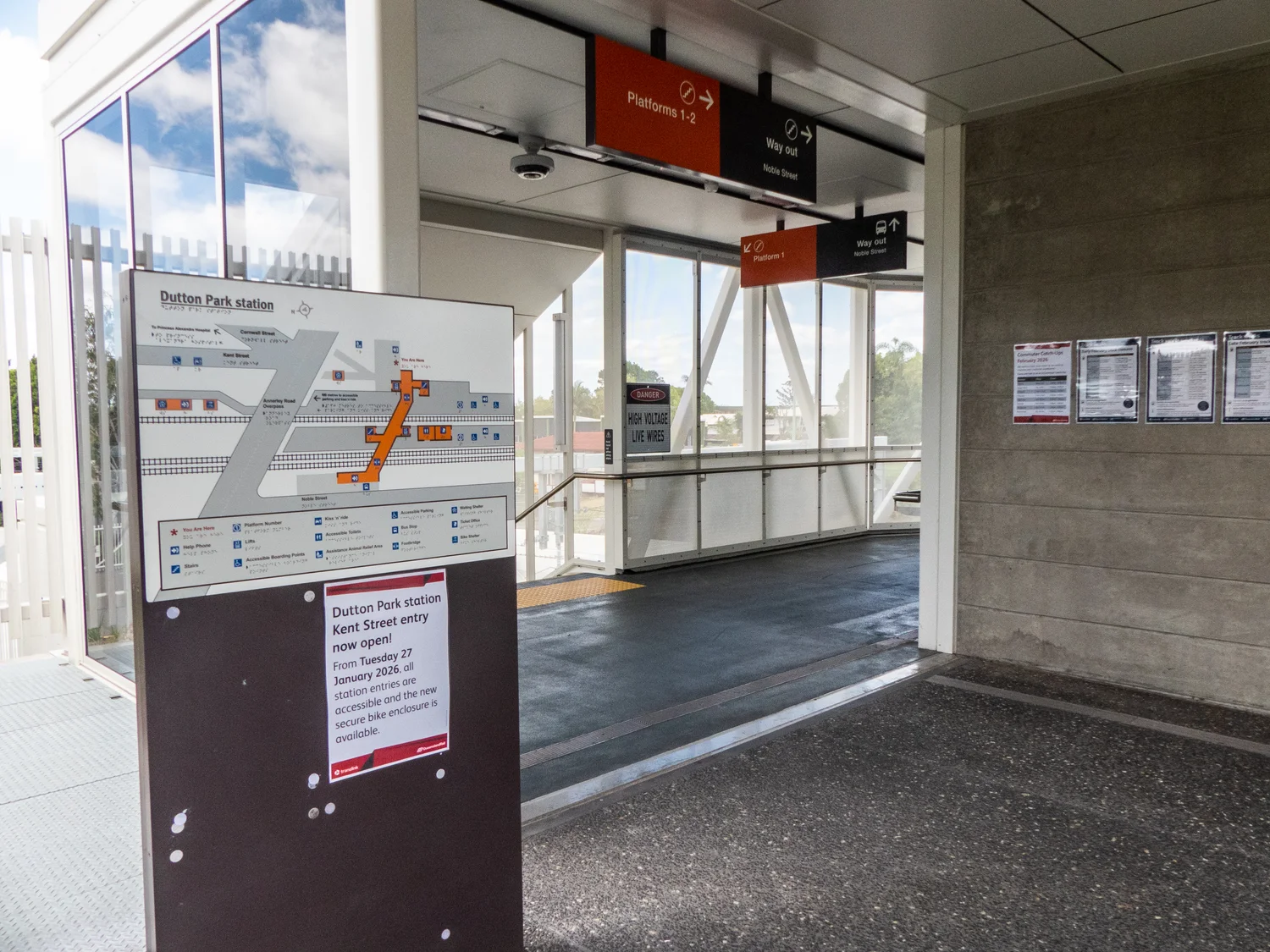
At the Annerley Road entrance to Dutton Park railway station in Queensland, a map stands beside part of the approach to the platforms. The photograph by John Robert McPherson shows the map on the left, with the station continuing beyond it. A viewer who stops there could see the entrance and decide how they relate to the image at once. A visitor reading partly or mainly by touch may approach the map differently. They need to find a beginning, distinguish the features it presents and translate a line under a finger into places they can recognize as they move away.
Both visitors can be looking for the same thing: a route to the appropriate platform, lift or way out. A map does not necessarily need to represent every wall and small item for either of them. It needs enough detail to help them find the next useful landmark. Touch makes that selection particularly visible. While someone using print can look over a whole plan and then focus on one detail, a finger encounters the details in sequence. The design of the map has to make a start and a sequence possible without asking a person to guess what each new texture means.
The beginning has to be a particular place
Consider the dot at the entrance where a wall map stands. In a conventional plan a visitor can identify a label saying they are here and find other parts of the station around it. A reader following a tactile representation needs a corresponding starting point they can distinguish from all the other symbols. The point should identify the actual place of the map, not just the general location of the address. If two maps sit at different entrances, the dot belonging to one should not leave a visitor thinking they are already on the other side of the building.
Direction matters once the dot is found. Imagine two doors that look similar on paper, with the lift to the left of one and the right of the other. A plan oriented to the visitor can make that information easier to apply. If it is oriented differently, the key and the surroundings need to offer some way to recover the relation. Words about an adjoining street, the nearest large turn or the side of the station that a person is on can help the same plan work as part of a real journey.
The same point can be supplied ahead of time. Queensland Rail offers station maps with text and audio descriptions in its accessibility information. A traveller who studies those can form a mental plan before arriving, then use the physical map or other signs to confirm which entrance they are using. Such preparation and the object at the station answer different moments in a trip. Keeping the names of points consistent makes them more useful together.
Remove detail where it gets between two useful cues
A surveyed drawing can show a station with many precisely measured walls and fittings. A tactile map has to make important features distinguishable at the size people can actually touch. Lines crowding one another leave little room to tell them apart. Different textures should be distinct enough to recognize after the fingers have followed a short path. A simple example is to give a route a continuous feel and give points of interest a separate, repeatable shape. A key can help someone learn what those features mean before looking for them in a less familiar section.
The omissions matter too. If every item on the plan resembles an obstacle by touch, the route can be harder to understand than it is in the room. A phone might give supplementary information for a station with many facilities, or a printed map might make another selection. The touch map should still supply the relationships its users need without requiring a person to touch every line in case something important is hidden among them. What can safely be left out depends in part on where it is installed and the people for whom it is intended.
A relief map and a braille sign have related but distinct jobs. Text can name a feature to someone who reads it. A raised line can represent an arrangement in space, whether or not a visitor knows a particular label. Someone who does not read braille may find other tactile or visual information useful. Raised elements, clear text and audio support offer more than a single alternative version. The needs of a student who knows the station and those of a visitor using it for the first time can differ even if both come to the map looking for the same destination.
Translate a line into the next recognizable place
Once a person has found a route on the map, they still have to travel it. The practical information is often the first or second decision: which corridor to take, whether to change level and which feature marks the next turn. A short continuous line could be clear to trace by touch and leave uncertain which opening to take when looking or listening in the room. A route that uses detectable or clearly labelled landmarks is easier to carry with you after leaving the board. It should be possible to confirm a decision before having to remember all the remaining ones.
A tactile map is also different from a tactile ground surface indicator. Queensland Rail describes textured ground cues as serving guidance and warning functions. A route map explains where things lie in relation to one another. A surface cue underfoot does its work where a person actually encounters it, such as approaching an important boundary. One should not assume that the raised line on a map and the textured element on the ground have identical meanings. Different kinds of cue help with deciding, proceeding and noticing where a change matters.
This distinction helps when staff are offering directions. A helpful instruction can begin with a place a person can already identify, then give the next certain point. A phrase about over there may be perfectly natural while someone is pointing and add no useful location for a person who cannot see the gesture. Naming the relevant route or fixed feature helps put the directions into the visitor's own movement. The map and the staff can use the same language without needing to make both explanations equally detailed.
A station can change while a fixed map stays in place
An entrance might change temporarily or a lift become unavailable. A physically installed map can remain accurate about the usual building and still give a poor description of the route available at that moment. This is where updated station information and local notices have their own role. To a traveller a general statement on a site may be too broad to identify a particular lift. A useful update describes the affected point, the consequence for the route and where a traveller can obtain current assistance. This matters particularly where another route may be longer or depend on steps.
Someone planning an improvement can examine the approach to the map itself during a busy period. Is the board easy to find, and can someone stop there without being pushed into the main flow of people? Is its face reachable from several positions? Can the person move from the board to the beginning of the suggested route and confirm that it still makes sense? Those questions are about the relation between the fixture and the station. A clear diagram presented behind a difficult queue line is not easy to use merely because the design has passed a test on a table.
Try finding a destination and coming back
A route is often described from the station entrance to the train. The return trip asks a person to recognise the inside of the station first and choose an exit. From the platform, there may be no reason to pass the map used on arrival. A plan for orientation should ask what the traveller can confirm in this direction too. A simple repeated name for the entrance helps, especially when another route leads to a nearby street.
There is also a difference between recognizing a name in the key and keeping it in mind while moving through an unfamiliar place. A station can give the user confidence at an intermediate choice, such as a landing or a change of passage. Designing those checks into the journey makes it less costly to recover from a wrong turn. It gives the board a useful relationship with nearby signs, instead of expecting the first map to answer every subsequent question on its own.
End with the next turn, not the whole building
The board in the photograph appears at the place where somebody is about to move on. Give it the work that belongs there: identify this entrance, make it possible to choose the next route and tell the traveller which place they can use to check that choice. Support the longer route with consistent signs, current information and ways to ask for help. The board does not have to carry the whole station in miniature to be useful.
A passenger need not remember the whole map as a picture. They may remember a turn, a change of level and how to recognize the next useful point. A tactile map earns the space it takes beside the entrance if that small amount of information is enough to let someone begin the journey with confidence and check it as they go.