The Button on a Subway Help Point
The light on a New York subway Help Point marks a place to ask for assistance. Its two buttons, the response on the other end and the space around it are all part of the service.
In this story 6 sections
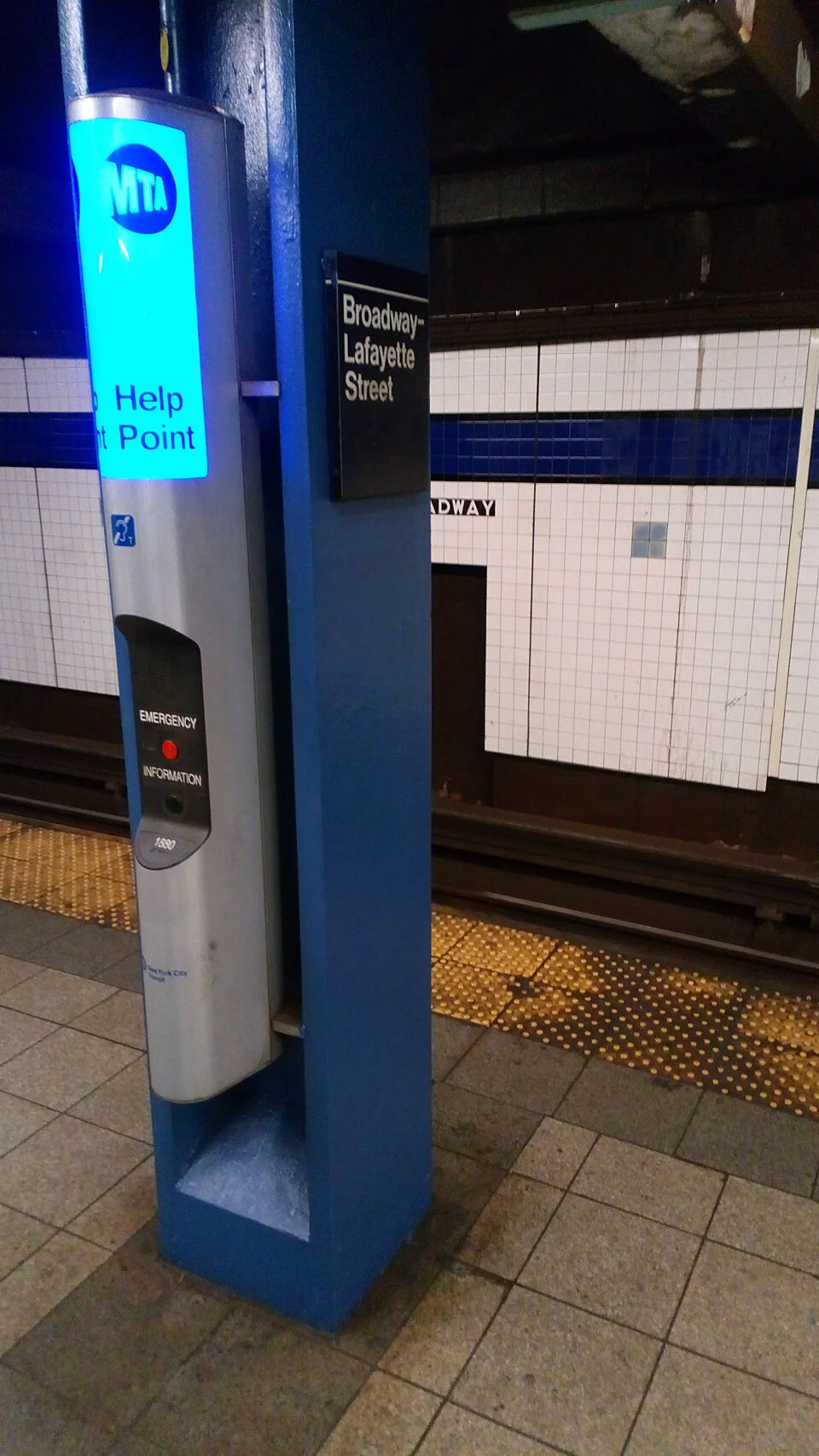
A patch of blue light stands out against the tiled station in Jess Hawsor’s photograph. The Help Point projects from a column. On its face there is a much smaller area with controls than there is illuminated surface above it. The two areas work at different distances. A person scanning a platform can see the blue from farther away. A person standing beside it can read what is available and choose a button. The equipment has to make both actions clear in a station where people are also looking for trains, stairs and signs to the street.
New York’s Metropolitan Transportation Authority describes Help Points as a means of contacting people from stations. Its guide identifies two buttons: an information button below and an emergency button above. The agency's current emergency page has more detailed instructions, including its guidance to call 911 and alert MTA staff if there is an immediate threat to safety. A Help Point is part of that public service, alongside other ways of reaching staff. Its role is easier to understand if you follow the stages from seeing the light to finding out that another person has received the request.
Find assistance while looking for something else
A traveller may not begin by looking for an intercom. They may be trying to reach a particular part of the platform or decide which way to exit. The coloured light helps them identify a place for a different decision. If Help Points generally carry the same visual cue, it can become recognizable across stations whose maps and platforms are otherwise quite different. That consistency saves attention at a time when somebody may have other things to work out. It does not remove the need for clear local directions or a legible identifying name.
Imagine a long platform with columns interrupting the view. A fixture may be easily visible from the opposite side and much less obvious when a passenger is looking along a row of columns. People waiting for a train may gather in a particular stretch without noticing that the route to the unit has changed. What matters is not simply whether the light is technically visible from an unobstructed point. It is whether a person approaching from the places people actually use has a good chance to recognize it and reach it.
Nearby signs have related jobs. A large station sign tells where the traveller is on the network. A smaller one may identify a particular part of the platform, an exit or a direction of travel. After finding assistance, these observations can help explain the location of an issue without revealing unnecessary information about the people involved. A clearly marked place can be useful both to the person asking a question and to the person who has never seen what the asker is standing beside.
The right distinction has to be made close up
The two buttons are labelled for different needs. General information and an emergency are not two words for the same queue. The MTA's guide uses labels, position and different button colours to distinguish them and describes raised lettering and braille. Colour may help the visitor who sees it immediately. It can do much less if someone cannot distinguish the colours or the light is reflecting off the face at an awkward angle. Redundancy here is practical. Knowing the meaning by one means doesn't require every other person to read the same cue.
What makes the design clear is the agreement between the label beside the button and the person or service reached after pressing it. A visitor with a question about the network can ask for information while somebody dealing with an immediate emergency needs a different response. The practical instructions on the device and from the operating agency matter more than any impression supplied by this photograph. They can specify what to do when alternatives exist. An older picture can show why the physical distinction is useful without serving as a comprehensive guide to current station operations.
There is also a difference between finding a button and being able to use the intercom. The agency describes induction loops to assist customers who have compatible hearing equipment. A clear approach and a reachable control matter as well. A person should be able to get close enough to communicate without obstructing the path of everybody moving along the platform. The design of the device and the way the surrounding area is used decide different portions of that experience.
A lit box is the beginning of an exchange
After somebody makes a request, they need to know whether a call is going through and what to expect next. Train noise and voices may make a quiet sound difficult to hear. A simple indication of connection or another clear prompt can give context to an interval that otherwise looks like nothing happened. It matters which stage the indication refers to. A unit can be powered and recognizable with its light while the person at the device still needs confirmation about the request they just made.
At the other end, a person receiving the call benefits from knowing where it came from and having a way to hear what the visitor is asking. The useful details will depend on the question. An account of a route may need the station and direction. A report of an unsafe situation needs a clear description and appropriate response. The communication is brief, but it can require the kind of judgment a label cannot supply on its own. This is why installing and lighting the unit represent only one portion of maintaining the service.
A 2024 review by the MTA Office of Inspector General looked at how Help Point calls were handled and recommended improvements in operation. The review is evidence about what the office examined at the time. It is not a prediction of any individual call or a report of the current condition of the device pictured. Its broader lesson is that testing whether hardware is present differs from testing whether a request reaches a suitable person and is handled. An agency can treat those as separate questions without deciding one of them is unimportant.
Where people wait to be helped
A visitor does not telegraph the reason they are seeking help merely by standing close to a blue light. They may need to read the labels first, or be trying to orient on a platform they have not used before. The surrounding space should remain legible during that activity. Directions that are visible without a person having to walk up to the unit can help both the person seeking it and other people who just need to pass. Guiding the flow of travellers through the area is a separate problem from making a noticeable light.
If the nearest point cannot be used, additional forms of published assistance and appropriate staff directions remain important. A person should not have to treat an intercom as the only possible contact because an old picture made it look like one. Current official guidance is what relates station points, staff and emergency procedures. A clear service description can leave room for someone to choose the channel suited to the situation rather than treating general information and immediate help as comparable requests.
Look at the service from both ends
A visitor's account of using a Help Point might start with how far they walked to find the light, which words they could read and what happened after they made a request. An operations account might begin a little later, with whether the request reached its destination and what kind of response it received. If the two accounts are studied separately, it is easy to overlook where a problem occurred. A short time recorded after connection will not describe how long the person looked for a usable point. An easy path to the column will not make the contact itself useful if the question cannot be heard.
This distinction helps explain why an agency may need observations about the station as well as records of calls. Moving a sign, clearing a path and improving how a conversation is handled are different pieces of work. If someone reports a problem, knowing its location and stage makes it easier to decide which part of the service needs to change. A sign at a station can also help someone distinguish where to seek immediate assistance from where to send later feedback about an experience.
Look at the light and the face separately
The blue panel does something worthwhile before a person has approached. It gives help a location on a platform whose objects may be nearly indistinguishable at a distance. The smaller face brings two different kinds of contact within reach. The same object also has to fit into a working station and reach a person able to respond. None of those tasks is exhausted by the instruction to press a button.
A well-run Help Point lets a traveller understand the stages without working them out aloud. Find the recognizable place, read the appropriate choices and learn whether the request has reached someone. The blue in the photograph is the clearest part of the object at first. It is useful because it leads toward a service that keeps making sense after the light is no longer the thing the visitor needs to see.