The Clock Above the Station Door
A railway clock gives people in a public room a time they can consult together. It has to be visible at the right moment and recognizable alongside signs that answer different questions.
In this story 6 sections
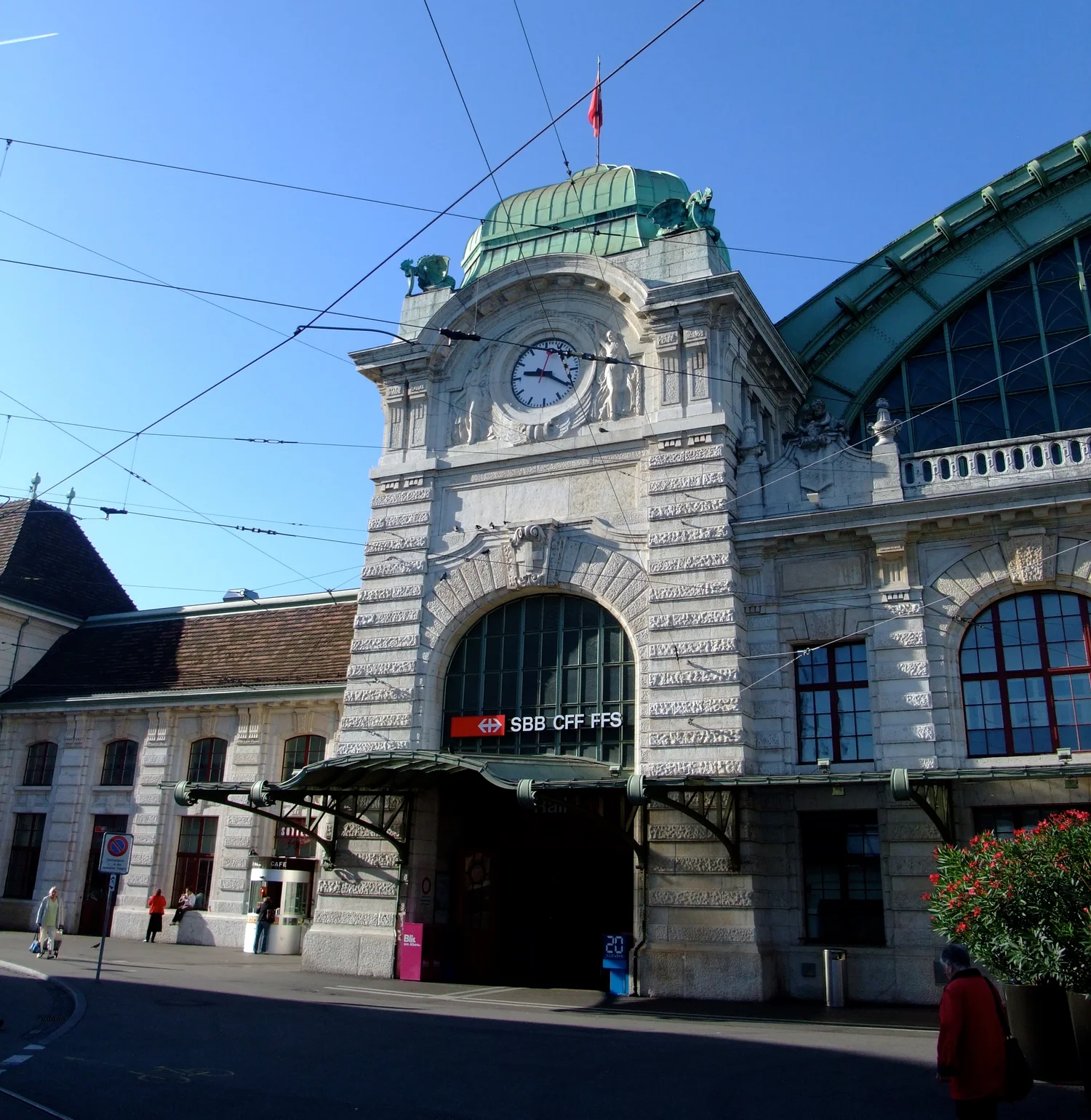
The clock rises above an arch in James Cridland’s photograph of Basel SBB station. Standing on the street, a visitor can see the entrance and the round face at almost the same time. There are signs lower down and details on the stonework around it. The clock does not need to read like either one. At a distance a person can ignore much of the lettering and look for the direction of two hands. Someone meeting them can read the same thing without picking up a phone or agreeing in advance whose watch to use.
A station clock has a useful, limited promise. It tells an ordinary time for several travellers in one place. It does not tell whether a connection has moved to a different platform or whether an evening train is running late. That is the work of departure information. Swiss Federal Railways describes several forms of information for travellers at stations, including boards with departure times and locations. Having one public reference for the current time makes those other forms easier to use, provided a traveller can recognize which piece of information they have found.
Use the clock before opening a timetable
Imagine a visitor reaching a station door and finding out that it is ten past the hour. A remembered train departure of seventeen minutes past is close enough to give them a first sense of urgency, but the clock has said nothing about which platform they need. A timetable shown elsewhere can add that detail or tell them the expected time has changed. The two answers work together. It would be difficult to use a timetable showing only a departure without some way to relate it to the present. The clock also remains useful to somebody who isn't going to take a train.
There are other questions a traveller can bring to it. Two people agree to meet outside and say the clock is the landmark. A person waiting for a friend might know the planned time much more clearly than the platform of the arriving train. In both cases the location and public value of the clock matter as much as which individual owns a more accurate wristwatch. The clock is doing a job for a group of people who are looking at the same building and could refer to it from different places.
Clocks do not all have to look the same to perform that job. The face incorporated into an architectural entrance has context a freestanding clock on a platform need not have. SBB's distinctive station clock serves as the model for its digital design, whose documentation describes the motion it reproduces. That is one widely recognized way to give railway time a common visual form. The photo of the façade does not establish which mechanism runs that particular clock or whether it mimics the motion of a standardized clock elsewhere on the network.
Make the face legible when someone is moving
The line of sight from a street corner differs from that of somebody standing near the door. A clock placed high can be available to more people at a distance, and it can also become difficult to read close up. Size, contrast, angle and other objects in view all contribute to how quickly a person can use it. SBB's digital guidance reflects a related concern when it distinguishes sizing for viewing distance and recommends a plain background. A fixed architectural clock has a particular site to work with. The digital display has to be designed for its own size and the distance at which it will be read.
Notice what a person needs to identify in a glance. A clear set of hour marks can give structure without requiring every numeral to be read. The directions of the two principal hands have to remain distinguishable against the face. Glare or a shadow can make a readable clock seem blank from one approach while another view looks fine. People who cannot see the clock clearly may benefit from a station's other ways of giving information. A prominent object can be part of accessible communication without being the only way to provide a time.
It helps to bring these checks into the setting itself. A clock a designer finds legible in a close-up view might sit behind a canopy from the side. A later advertisement or screen could compete with it for attention. Step back to the actual choice point, where people decide whether to enter or what direction to walk, and ask which information is visible from there. The size of an object alone will not answer which jobs it can do in that spot.
Several clocks make agreement noticeable
A station may give a traveller several views of time between the entrance and a platform. If they show substantially different values, someone may wonder which one should guide the next decision. The dissonance can matter even though the people checking the clocks individually could each read their hands without difficulty. A useful arrangement gives the reader reason to treat the displays as compatible parts of the same service. SBB’s digital guidance distinguishes the visible clock from the system time it displays and calls for a reliable source where it can be supplied.
An analog display can have motion that is recognizable to regular users. SBB's digital design reproduces the familiar pause of the seconds hand near the top of the dial before the next minute starts. It is an example of translating the behavior of a physical design into another form. The purpose of noting the pause is to distinguish an expected rhythm from a clock that has stopped telling time. It is also a reminder to compare the right parts of observations. Looking at two moving hands a moment apart is not necessarily evidence that two displays disagree about the current minute.
Keep schedules and clock time visibly distinct
A railway board can show a scheduled departure and a revised prediction. It can also show a remaining number of minutes, which will not have the same visual structure as a time of day. A passenger comparing a clock with the board should be able to tell which sort of information the board intends. A glance while carrying a bag leaves little room to infer the distinction from design alone. Small labels can preserve quite different meanings, especially where two numbers appear close together.
The same care helps when equipment is unavailable. A stopped physical clock can continue showing a plausible time from a distance. If staff can indicate that it should not be relied on and show another source, the clock remains a recognizable meeting point even before it resumes doing its service. The place and the indication can have separate lives for a little while. A documented repair needs to pay attention to both the correctness of a mechanism and its public appearance.
Decide what to do while a face is out of service
A clock can still make a good landmark when its hands have stopped. That is convenient for meeting someone and awkward for reading an hour. If a stopped face looks like a functioning one, a passerby may not realize that the problem is with the display. People who arrive at different times can see the same reading and draw different conclusions about whether they have missed an appointment or a train. From far away there may be no reason to study the hands long enough to catch the fault.
A notice should therefore work close to the point where someone would normally look, and point to a known alternative. The relevant fact for the person arriving is whether the clock is in service. If another public display has current time clearly marked, its position can be useful in a temporary notice. For someone who needs an accessible route to information, a direction that goes through a doorway or up a flight of stairs may be less useful than a place they can reach on the way to the concourse. Giving the nearest usable reference is a more precise job than mentioning that there are other clocks somewhere in the station.
These precautions also help distinguish time from relative estimates. An indicator that says a train is due in four minutes is tied to a particular service, an update interval and whatever event the system is counting down to. The face over the door has a much wider audience. A person about to meet a friend in the square may have no reason to find a train at all.
Check the hour on the way through
The large face in the photo contributes to the way the entrance can be found. It also gives a point for seeing time together before people disperse toward different parts of the station. The sign for a train and the description of a route will take over other jobs as they move. A good clock leaves room for those jobs by being recognizable at the moment its own kind of information is useful.
The station entrance gives people a place to agree where they are. The clock adds a closely related fact, one that will change even while everybody is still looking. The skill is to make that shared fact quick to check and easy to use with the other public information a journey requires.